

A bakery, a law office, and a music venue may all need their names displayed prominently, but the same sign would not suit all three. Signage communicates more than a business name. Its lettering, material, lighting, and placement help customers understand what kind of experience they can expect inside.
That makes choosing a sign a branding decision as much as a decorating decision. Before picking a color or approving a logo layout, consider the impression you want to create. A playful glow, a crisp metal finish, and a softly illuminated backdrop each offer a different way to introduce your business.
Start with the Personality of Your Business
Describe your brand in three words. Perhaps it is warm, informal, and creative. Perhaps it is precise, understated, and professional. Those words can guide your signage choices more effectively than following whichever style you recently saw online.

For example, a dessert shop might choose expressive lettering that matches its packaging. A consulting firm might favor a simpler logo treatment. Neither needs to copy another business to appear established.
Also consider the surroundings. Exposed brick, pale painted walls, dark wood, and patterned wallpaper create different backgrounds. A sign should feel connected to the room while remaining clear enough to recognize. Bring photographs of the intended location into the design discussion instead of evaluating artwork on a blank screen alone.
Choose Neon for an Expressive Visual Focal Point
A neon sign draws attention through illuminated lettering or outlines. It can turn a short phrase, business name, or graphic into the feature customers notice when entering a room.
This style offers useful possibilities for businesses with a strong social atmosphere. Think of a record store displaying its name above a listening station or a neighborhood cafe adding a welcoming phrase near communal seating.

Keep the message short enough to read at a glance. An elaborate sentence may look appealing in a close-up image but become difficult to follow across the room. If the logo already contains intricate details, consider whether the business name alone would make a stronger illuminated display.
NeonChamp offers neon sign custom with choices for text, fonts, colors, sizes, and backing styles. That gives businesses a starting point for adapting the design to their identity.
Use Metal to Emphasize Form and Finish
Metal signage puts attention on the physical design: the outline, lettering, surface, and relationship between the sign and its background. It can suit a pared-back reception area, an industrial interior, or a shop that wants a clear brand marker without another prominent light source.
However, metal does not automatically mean formal. A playful illustration can feel inviting, while a bold monogram can make a compact wall display feel distinctive. The artwork matters as much as the material category.
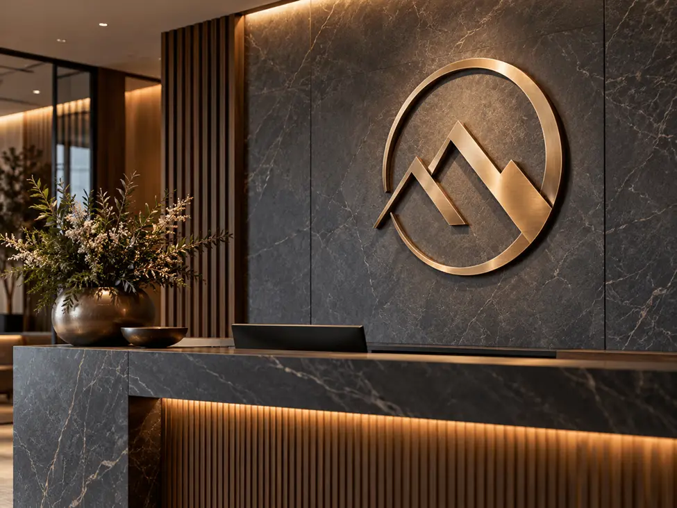
NeonChamp’s custom metal signs include aluminum, steel, and brass material options. Discuss the proposed location and finish before deciding which option fits your project.
For a business interior, consider how the sign looks alongside existing fixtures. Repeating one finish from shelving, handles, or furniture can help the display feel deliberate rather than disconnected.
Consider Backlighting for a Defined Brand Display
Backlighting offers another approach to illuminated signage. Rather than relying only on glowing strokes, it introduces light behind a physical design. NeonChamp’s custom backlit signs use LED lighting to create a halo around logos, lettering, or artwork.
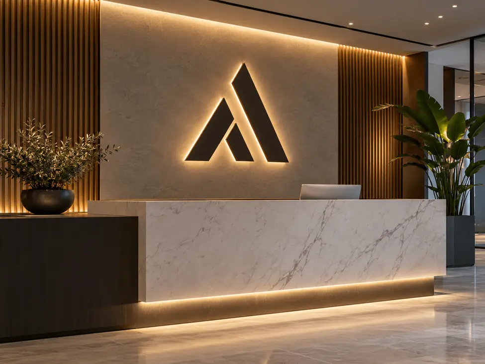
This makes backlit signage worth considering for a reception wall, restaurant entrance, or customer waiting area. The design can serve as a clear brand marker while contributing to the room’s atmosphere.
Evaluate the background carefully. Wall texture, color, nearby fixtures, and ambient lighting affect how the illuminated display appears. Ask to review a mockup that reflects the installation setting, then discuss any practical adjustments with the supplier. A beautiful isolated logo is only one part of a successful finished display.
Give Each Sign a Specific Job
Choosing among these categories becomes easier when you define the purpose first. Are you identifying the business, helping visitors find reception, decorating a seating area, or creating a branded background for photographs?
An entrance display should prioritize recognition. A decorative interior sign can be more expressive because people have time to look at it. A directional sign needs a straightforward message that helps someone act immediately.
For businesses that welcome walk-in customers, an open neon sign can communicate a different message from the main brand display. One tells people whether they can enter; the other tells them whose business they have found.
Separating these jobs prevents the main sign from becoming overloaded with hours, slogans, service lists, and unnecessary decorative details.
Combine Sign Styles Without Losing Consistency
You do not need to use one material throughout the entire premises. A business might place a metal name display near its entrance and use illuminated lettering at an interior photo spot.
The connection comes from a shared design language. Repeat the same business name, recognizable logo elements, and a controlled color palette. Allow materials to change while keeping those identifying features consistent.
Imagine a small fitness studio. Its reception sign could show the full business name, while a workout wall carries a short motivational phrase. Both displays can support the same brand without looking identical.
Avoid letting every sign compete for attention. Decide which display is the main focal point and give the others supporting roles. This creates a clearer visual hierarchy for customers moving through the space.
Check the Practical Details Before Ordering
Measure the available wall area, identify the normal viewing position, and photograph nearby furniture. A sign that fits the wall may still feel too small above a wide counter or too crowded beside shelving.
For illuminated designs, plan access to power and the route of visible cables. Discuss mounting requirements, the installation surface, and suitability for the intended environment. An exterior placement deserves a specific conversation about exposure and electrical arrangements.
Finally, review the spelling, dimensions, colors, and approved artwork together. NeonChamp’s range lets you compare different signage approaches before committing to a design. Start with the impression and purpose you want to achieve, then select the format that expresses them clearly. The right choice should look like it belongs to your business from the first day it is displayed.
Also Read
- https://metaphorhaven.com/discover-the-benefits-of-ultherapy-in-sydney-a-non-surgical-facelift-solution/
https://metaphorhaven.com/what-new-shop-owners-wish-theyd-known-before-opening-day/
https://metaphorhaven.com/enhancing-lives-with-positive-behaviour-support-in-adelaide-a-comprehensive-guide/