Creating a user-friendly contact page remains one of the most effective ways to turn website visitors into actionable leads. With so many choices online, users will not hesitate to leave if reaching out to you feels difficult or untrustworthy. An optimized contact page removes obstacles and directly encourages communication, a key factor for any business website. For a deeper look at successful contact us page UI design, analyzing leading examples can provide clarity on what works best in today’s digital landscape.
Even subtle missteps in layout or messaging can result in lost opportunities. That’s why attention to every detail on your contact page matters. Done well, it fosters trust and convenience, setting the tone for positive user engagement. Visitors are far more likely to reach out if they encounter streamlined forms, trustworthy details, and genuine calls to action. Usability research confirms that excessive fields and obscure contact information consistently drive user drop-off.
Importance of a Well-Designed Contact Page
The contact page is the bridge between browsing and taking action. For many visitors, it is their last stop before reaching out to your team. The quality of this page can make or break your chances of hearing from potential clients or customers. According to Nielsen Norman Group usability studies, unnecessary form fields and weak trust-building cues are the primary sources of abandonment on contact pages. Your contact page must assure visitors that it is both safe and rewarding to connect with you.
Additionally, search engines actively look for prominent, genuine contact information as a trust signal, which can aid your site’s local and organic rankings. Ensuring visitors can easily reach you not only improves conversion rates but also establishes credibility in highly competitive markets.
Key Elements of an Effective Contact Page
Encouraging visitors to reach out starts with the thoughtful inclusion of several crucial elements:
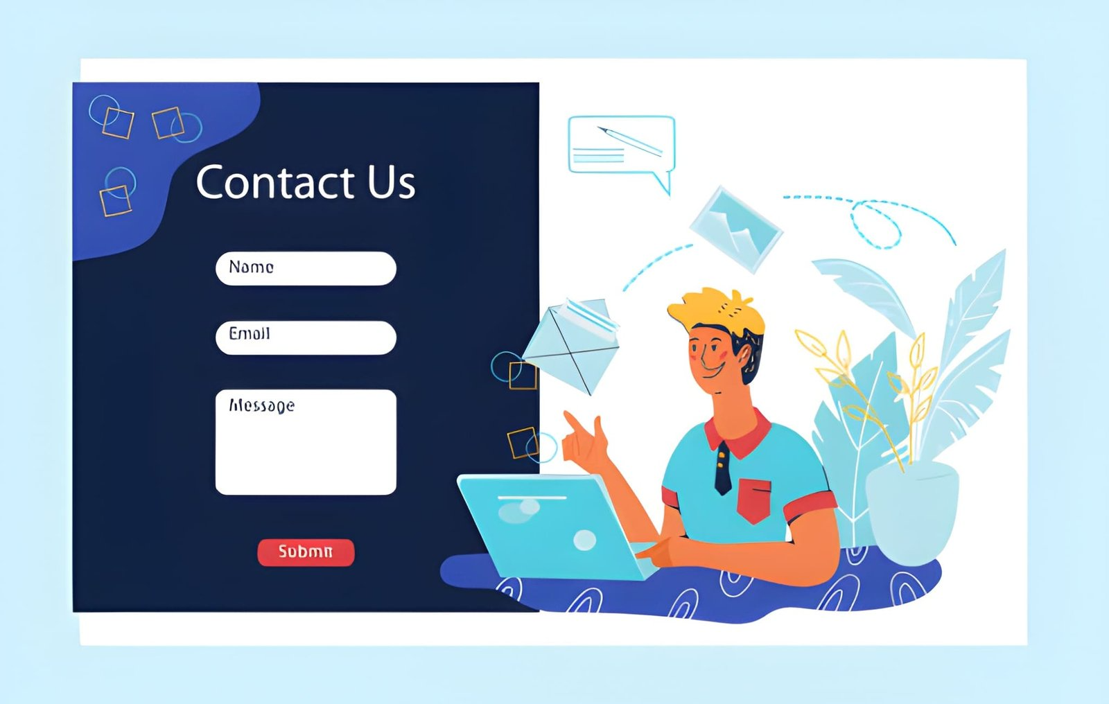
- Concise Contact Form: Limit requests to only what you actually need. Keeping form fields to three to five entries reduces the chance of users abandoning the process.
- Clear Contact Information: Display your email, phone number, and physical address prominently. Multiple contact options accommodate user preference and enhance perceived legitimacy.
- Specific, Action-Oriented CTA: Buttons or prominent text such as “Get in Touch” or “Book a Free Consultation” guide users toward action.
- Expected Response Time: Let users know when they should expect a reply. Knowing that they will be contacted within a set period increases their willingness to submit the form.
- Visible Trust Signals: Add privacy policies, social proof, and certifications. These elements demonstrate commitment to user security and professionalism.
Best Practices for Contact Page Design
Using proven design tactics will significantly improve your contact page’s effectiveness:
- Keep the Form Short: Restrict form questions to essential details. This minimizes perceived effort and increases user completion rates.
- Mobile Optimization: Responsive design is a necessity. Make sure your inputs are large enough for touchscreens and that loading times are minimal for mobile users.
- Brand Consistency: Your contact page’s design, tone, and visuals should reflect your overall website style to maintain coherence and build instant trust.
- Multiple Connection Options: Not every user will want to fill out a form. Providing direct emails, phone numbers, or messaging channels empowers all users.
- Location Maps: For businesses with a physical presence, embedding a map improves directions and adds authenticity.
Common Mistakes to Avoid
Contact pages are sometimes neglected, but steering clear of these issues can ensure ongoing success:
- Overly Complex Forms: Requesting superfluous information will turn even the most enthusiastic prospects away. Focus on just what is needed for initial engagement.
- Hidden Details: Calls, emails, or addresses that are buried in the footer or behind obscure menus decrease conversion rates. Make contact methods easy to find.
- Missing Trust Elements: Users are increasingly cautious about where they submit personal information. Omitting reassurances, such as privacy policies or reviews, undermines confidence.
- Poor Visual Consistency: A contact page that clashes with your main site’s branding is jarring and may make users question your legitimacy.
Examples of Effective Contact Pages
Examining real-world success stories helps identify what works best. Framer Websites, for instance, focus on a streamlined form, visible response expectations, and multiple contact methods to ensure visitors can always find a way to get in touch. Their page demonstrates a balance of formality and personalized guidance that supports conversion. To dive into the details, visit their case study at Framer Websites.
Express Jam Studio similarly emphasizes a short, focused form, immediate acknowledgment of inquiries, and no-hassle access to their contact options. Their user-centric approach is outlined at Express Jam Studio.
Conclusion
Every impression counts. Your contact page is more than a simple web form; it is the final step in nurturing visitor interest into genuine connection. By emphasizing clarity, limiting barriers, showcasing multiple contact avenues, and leveraging trust signals, your website’s contact page can drive more leads and higher satisfaction. Prioritize these elements and principles to energize user engagement while supporting your broader business goals.
Maximizing Business Potential with Serviced Offices in East Perth – metaphorhaven.com
Unlock the Healing Power of Cupping Therapy with Our Online Hijama Course – metaphorhaven.com